Ever imagined that a sign can impress a passerby in just three seconds and inspire them to take action? Seems impossible, right? But the hard truth is that it is very much possible because a customer driving past a business makes their decision faster than one can think.
Remember that a car driver is still on the street and has seen your sign from a distance while moving. He hasn't noticed your storefront, yet he reads your sign, understands your business, and understands the products or services you offer. Thanks to your effective roadside sign for making it possible. Your sign engages with the customer and speaks to them first. But here's the real catch. The drivers usually give your sign only a few seconds of attention and make an attempt to understand the message it communicates.
If your roadside sign truly engages with the vehicle owner, then it isn't just a showpiece, but your real brand ambassador that silently works around the clock to spread your brand visibility. The amazing truth is that your sign doesn't pause even while working at traffic speeds. There is a painful fact associated with a roadside sign. If that sign fails to communicate the actual message instantly, your opportunity is lost at traffic speeds.
Drivers Don't Read — They Scan
What were your first thoughts when you decided to design your first roadside sign? Like traditional signs, will customers stand still to read and understand your sign? But this is a myth.
Most businesses carry this impression; hence, they overload signs with information, believing that more text will grab more attention, creating more value for their brand. Now here's the painful fact. Drivers drive their vehicles at high speeds, making it impossible for them to read your roadside signage word by word.
Experts are of the opinion that the human brain processes visual information frame by frame. The first things that the brain recognizes before text are colors, shapes, contrast, and lighting. So here's the secret. Roadside sign visibility purely depends on instant recognition instead of long details.
When you want your roadside sign to succeed, you must switch to quick-read business signs to communicate your concept instead of the traditional long-text signage. It doesn't make sense to make your sign too decent. A successful roadside sign should always have a bold color combination, large typography, and a strong visual appeal. All these put together will enable people to understand your message with zero effort.
Revive from your memory the sign you saw while driving on the highway. How did you remember that sign? You remembered that roadside sign because it was simple, bold, and easy to recognize while driving. The psychology behind you remembering it is high-impact outdoor signage. A human brain is trained to respond faster to simplicity and clarity than to complex texts.
Businesses that understand this psychology win the race. Such businesses can align with a professional roadside signage design company to build an attention-grabbing roadside sign. It is essential to understand one important truth. If a customer has to slow down their vehicle to understand your sign, then your sign is an utter failure; it doesn't exist.
One Message Always Wins Faster
Should a roadside sign try to say everything at once?
Of course, no. But this is what most traditional signs do, but a roadside sign is not meant to do the same.
The biggest reason behind the failure of effective roadside advertising is overcrowding it with several messages. Just think, are three seconds enough to read and understand all these several messages? Does crowding your sign with discounts, contact numbers, slogans, websites, social media handles, service lists, and brand promises really serve their purpose? In fact, all these details compete for users' attention on just one single board.
Imagine a classroom where there are almost 20 students and one teacher. Now, all students shout to grab the teacher's attention. Whom will the teacher listen to? Replace the classroom with the roadside sign and students with multiple messages. Now, who will the customer (teacher) pay attention to? There will be no output except pure chaos and confusion.
When it comes to understanding a roadside sign while driving, "TIME" is the biggest constraint and the most decisive factor that determines the success or failure of your brand. When a customer drives past your sign, they actually lack the time and focus to process five ideas simultaneously. In such a situation, the driver's brain can easily and effectively process just one clear message instead of several complex, competing messages, and this is true for everyone in this situation.
Hence, a simple outdoor sign design focused on one objective performs better, creates stronger recall, and helps with faster message processing.
For example:
- A restaurant sign may focus only on the brand name.
- A retail store may highlight one promotional offer.
- A gas station may prioritize directional visibility.
- A medical store may highlight essential services like prescription filling, OTC medication, health products, or 24-hour availability.
The above examples show that each business should have a focused approach. This approach will strengthen your overall business signage strategy. Be so unique in your approach that, just with one glance, the customers should understand what matters most.
Just one simple message is adequate as long as you present it as clear marketing signage that doesn't overwhelm, but guides attention with precision.
Empty Space Creates Stronger Impact
Space doesn't indicate a lack of content, but a powerful support that adds value and clarity to the message in your existing sign. So your mindset shouldn't be to use every available inch of space, but to offer a free-breathing space to create the strongest and most empowered visual.
Negative Space, otherwise called white space, reduces visual clutter and creates intentional breathing room for the viewer. Check out the following example.
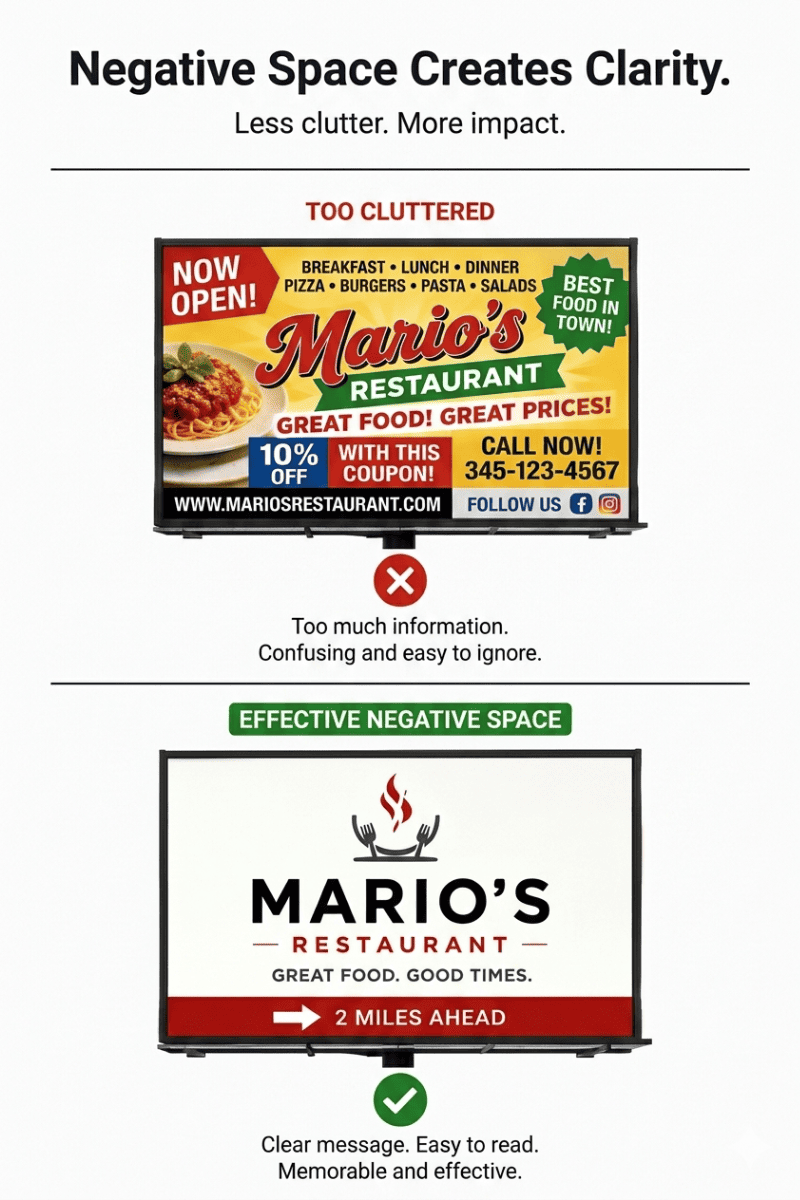
Your signage printer uses this minimalist sign design approach to improve readability and help important elements stand out faster. It is this white space around text and graphics that actually works as a catalyst to make the message and design stand out. Crowded signs appeal to no one. Such signs actually create visual stress on moving drivers and make it difficult for their brains to process information quickly. Instead, a clean, clear, and simple layout gives enough room for the eyes, enabling them to focus.
Imagine two roadside signs:
- One is packed with tiny text, logos, and images.
- The other displays one bold message with adequate spacing to make the message stand out.
In most cases, the second sign will always outperform the first one.
People love seeing uncluttered visuals. Modern customers associate these visuals with maturity, professionalism, and confidence. Hence, you would mostly see clean roadside signage attracting the driver's attention. Such clean visuals are a treat to one's eyes. They create a stronger first impression without overwhelming the audience with overly decorative designs.
Amidst crowded and overdecorative visuals all around, today's modern outdoor signs have adopted the secret of simplicity. Spacing can create wonders only if done strategically. Rightly balanced spacing helps the advertiser create elegance, visibility, and stronger communication through their simple roadside signs, even in three seconds.
Why worry when you can convert your ordinary-looking signage into professional business signage with the magic of good spacing that customers trust and love remembering?
Sign Height Changes Customer Attention
No passerby will strain their neck and eyes to look at a beautifully designed sign that's improperly placed or misaligned. If your sign can't engage with the driver, it is an utter failure.
When considering a roadside sign to market your brand, product, or service, remember that your prospect will be watching it from a distance while driving their vehicle. The customer's comfort is more important than anything else. Along with the distance, the height of your message is equally important, as it directly affects how customers notice, perceive, and process the message. An ideal position is one where the driver doesn't need to look too high or too low. A simple horizontal movement of his neck is enough to help him read the sign. Signs positioned too high may fall outside a driver's natural line of sight. Signs placed too low may be blocked by traffic, landscaping, or nearby structures.
Not every road is built the same. Hence, you cannot relate the placement of a sign on one road to the placement of the sign on another road. A standard roadside sign placement requires a proper understanding of traffic behavior and viewing distance. You should also have an estimate of the average height of the vehicles driving on the road.
Drivers are responsible for focusing on the road ahead. Hence, their range of sight is fixed. This makes it difficult for them to view objects far above eye level. Hence, it goes without saying that the sign visibility depends heavily on correctly positioning your signs. You must ensure that your sign comes within the range where the driver's eyes naturally travel.
Ideally, the logic of commercial sign height depends on traffic speeds:
- High-speed roads require earlier visibility and greater elevation.
- Urban streets often perform better with lower, eye-level signage.
Businesses should understand this outdoor sign visibility logic and think strategically. They should consider approach angles, sightlines, and distance while placing their roadside signs.
The effectiveness of traffic-facing signage goes beyond design because the right placement is equally important.
Motion Changes How Signs Perform
As we discussed previously, the speed of the vehicle is a critical factor in deciding the placement of the signage. Just imagine that Vehicle A travels at the speed of 20 miles per hour while Vehicle B travels at the speed of 70 miles per hour. Both these vehicles see a specific sign. Do you feel that the outcomes will be the same?
Vehicle speed is a pertinent factor that determines how and what information a customer will absorb. The faster the motion, the less time to read a message, and the slower the motion, the more time to read. Hence, your message has to be simpler if your target customer drives at higher speeds.
Remember that a highway business sign should support the following 4 concepts, and the fourth one is most important:
- Larger typography
- Shorter wording
- Stronger contrast
- Minimal distractions
Considering otherwise, if you are targeting slower urban roads, then your customers may have slightly extra time to notice, read, and (perhaps) understand your secondary details.
Actually, it is this relationship between the speed of the vehicle and the ease of readability that makes fast, readable signage an ideal choice for high-traffic areas.
Many businesses commit the blunder of using the same sign style at several locations without understanding the traffic conditions in that particular area. Please understand that signage that works great on a neighborhood street may not prove effective on a busy highway.
Even your preferred signage maker in Cayman will recommend that you adapt your roadside advertising design to the speed of the vehicles in that environment. Just creating a smart roadside sign isn't enough. Your sign should respect the driver's reaction time. In every case, drivers need enough time to notice your sign, read the message, process the information, and respond to the message appropriately. This is the real reason behind professional designers carefully considering response logic principles while planning the layout.
Weather Quietly Damages Brand Perception
Once installed, you won't be there to look after and take care of your roadside sign daily against harsh weather conditions. A damaged sign attracts customers' attention more than organizations can realize, and that is where your trust and brand credibility are at stake.
Have you seen anyone appreciating a sign that has faded colors, peeling vinyl, rusted edges, poor illumination, and cracked materials? People in reality won't even care to look at such a sign and silently start neglecting it. Even if your business delivers excellent service, deteriorating signage can curb customer trust and deter them from walking into your storefront. These are serious reasons why you must make sure to install durable outdoor signage that's way beyond appearance alone.
Does the quality of your signage imply the quality of your business? No will be your obvious answer, but many people generally associate them. A general customer perception will be that a poorly maintained sign may trigger a dislike in the customer's subconscious mind. Signs in a pathetic state project outdated services, a lack of professionalism, and low attention to detail. These factors negatively impact your credibility and deteriorate your brand value, which is never in the interest of your business. Hence, a smart move will be to invest in weather-resistant business signs and protect the visibility of your brand and its reputation. Isn't that what you want?
Exposure to sun, heavy rains, humidity, strong winds, and storms over time damages your signage materials, creating a negative impression for your customers. Now the question here is to protect your visual asset. You simply begin with a regular inspection, followed by updates and necessary maintenance. When signs lose their visual beauty, strength, and readability, they no longer remain an asset for your business.
Replacing your old signage should be the last step. With regular care, you can maintain the shape and beauty of your signage. If matters slip out of your hands, the only option left is to replace the visually worn-out sign with a fresh one. Never undermine the power of regular maintenance because it is an important and integral part of good brand management practices. Timely faded sign replacement will help your business maintain its credibility and customers' confidence. It will also enable your brand to continue looking young, trustworthy, modern, and professional each day.
Similar Blog: Importance Of Outdoor Signs For Your Business
Great Signs Trigger Emotional Memory
Every brand creates an emotional memory through its unique logo, design, or a simple but effective punchline. The moment you see one of them, you suddenly remember a product you bought a few months back. The same goes for a roadside sign. A roadside sign isn't limited to sharing information but is meant to create a lifetime bond with its audience.
It is quite obvious that one may forget the exact wording mentioned, but they would always remember how that sign made them feel. Your reliable signage maker will suggest a clever design, a unique shape, bold lighting, and a creative visual concept. All these put together will convert your roadside sign into a psychological magnet that will leave a lasting impression long after someone passes by. This psychological magnet is nothing but the power of memorable business signs.
While driving through a street, you see many signs. Some of them feel awesome and welcoming, while others fail to impress you. Only a handful of signs feel premium, exciting, fun, or trustworthy. This emotional bonding with the sign helps businesses remain recognizable and visible even in crowded environments.
combines visibility with personality.
There are a couple of influencing factors that transform your simple-looking signage into strong, creative roadside advertising.
They are
- Color psychology,
- Illumination, typography,
- Design style.
All these factors have the power to influence the customer's emotional response. You don't need to be big and bold every time; even strategically displayed subtle details help improve brand perception and customer recall rate.
Businesses must put in efforts to improve their brand perception because a strong perception emotionally connects with your customer, drives their future decisions, and transforms them into loyal customers. That is why modern companies increasingly invest in custom outdoor branding to elevate their roadside sign into a profit magnet.
Build Smarter Signs With SignSolutions
At SignSolutions, we approach signage as a visibility strategy, not just as an information project.
From traffic-focused layouts to premium materials, every sign is designed to maximize attention, readability, and long-term performance. Whether your business needs illuminated displays, directional signage, storefront branding, or large-scale roadside signs, SignSolutions creates signage built for real-world customer behavior.
As specialists in custom outdoor signage in Cayman, our team understands that the road conditions, the viewing distance, weather exposure, and traffic flow affect sign performance.
Our expertise in professional sign installation ensures that every sign is positioned for maximum visibility and lasting impact.
More importantly, SignSolutions is one of the region's trusted commercial signage experts, helping businesses create branding that customers notice and remember.
If your current sign is blending into the background instead of attracting customers' attention, now is the time to rethink its performance.
Contact SignSolutions today to schedule a consultation and build a roadside sign engineered to impress customers in just three seconds.