You sit down to read your newspaper every day as usual. There is a page in that newspaper that carries the maximum advertisements from different business domains. Do you read them all with the same focus, or do you skip most of them? When we come across ads, our brain commands us to filter them and move to read something more essential.
In our daily lives, we come across thousands of advertisements, billboards, storefront displays, digital screens, and promotional messages. Whether we are walking down the street or driving to our workplace, hardly a handful of these advertisements are fortunate enough to win our conscious attention.
Now, why does such a thing happen? The answer lies inside us. Our brain has a special ability to filter (unnecessary) information through a process known as "Selective Attention."
Selective attention, as the name suggests, helps the viewer ignore visuals that are cluttered and focus primarily on important, relevant, and time-critical information.
Can you imagine our mental state if our brain did not have this ability? Without this natural filtering system, we would be mentally overwhelmed, and our daily lives would be total chaos.
So, to tempt the consumer's brain into noticing their advertisement, Sign Designing Companies in Cayman create attention-grabbing signage. Visual marketing psychology is at the core of these unique and brand-driven signs. They allow businesses to communicate effectively before customers even realize what they are looking at. Well-designed, effective business signs quietly separate themselves from surrounding distractions and earn valuable seconds from their consumers.
A fact that every reader must know is that a successful customer attention signage doesn't need to fight against human behavior. On the contrary, this signage syncs well with the human brain and facilitates the brain to notice, process, and remember the message.
Eyes Follow Contrast Before Content
Why do our eyes become fixed on those signs that have effective contrast? It is because that contrast offers enough clarity to help our eyes read the text with ease.
The human visual system has a natural tendency to be drawn to differences in brightness, color, and visual separation. Imagine a sign that has a strong contrast. The moment our eyes see it, we immediately detect the text and design on that sign. But the same doesn’t happen where the text and design blend with its surroundings or contrast.
That is exactly why high-contrast signage performs consistently, whereas low-contrast designs fail to appeal to the user. If you truly want to see the magical effect of a high-contrast sign, simply check out two scenarios.
- Having dark lettering on light backgrounds,
- Having lighter lettering on darker surfaces.
In both the above cases, readability enhances dramatically.
Beyond high contrast, color hierarchy also plays a vital role in promoting good sign visibility design. Every sign has two types of information, where the primary one must receive the strongest emphasis, while the supporting information should be a couple of steps down.
What would happen if all the elements of your signage compete for the same amount of attention? This is practically a rare condition where the message becomes confusing, the sign doesn’t receive the right kind of attention, and the focus is lost.
If your business thrives on outdoor sign readability, you can‘t afford to have poor contrast in your signs. It is unfortunate that even the most attractive sign becomes invisible during bright sunlight, rain, or nighttime conditions.
Hence, go ahead and choose the right business sign color contrast and let your customers see your message before they move past it.
Shape Recognition Happens Instantly
Research has shown that our brain recognizes shapes long before we read the text.
Our brain has the capacity to process familiar silhouettes, symbols, and outlines in milliseconds. This specialty of the human brain is the core secret to why we recognize logos almost immediately, even without reading the company name.
Modern-day signs are no longer limited to traditional rectangles. Businesses have moved forward and have started using custom sign shapes to tell their brand story. With the use of unique contours, distinctive borders, and recognizable icons, companies have been able to create a visually strong image that easily gets stored in our memories. This technique helps your sign stand apart from nearby competitors.
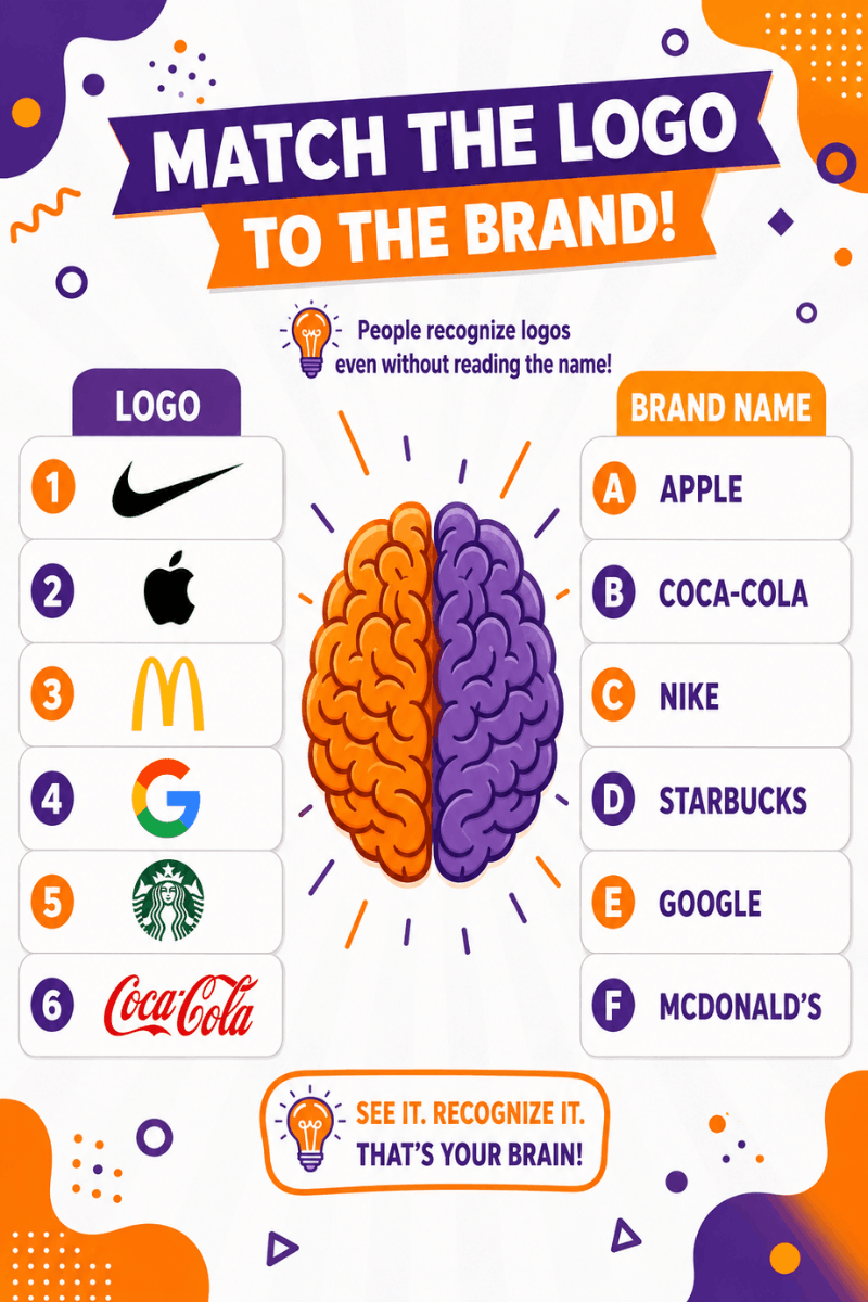
Strong brand recognition signage combines memorable shapes with consistent branding elements. Your customers might see the sign from across a parking lot or while driving past. In either case, they will still associate the logo’s visual identity with your business.
When you invest in unique business signs, you are triggering the customers’ recall memory. You are reinforcing your company's visual branding design. This process will make their brand recognition almost effortless in the future.
Typography Controls Reading Speed
Correct use of typography can make your sign appear amazingly beautiful. It determines how quickly people read and understand your message.
If you love decorative fonts, then a brochure or a catalogue is the best place for them. But if you use these decorative fonts in your sign that people view from a distance or while in motion, reading the message becomes an uphill task. Your viewers’ readability will be significantly compromised if you use thin lettering, excessive flourishes, and cramped spacing in your outdoor signs.
Using professional sign typography design will deliver the best possible clarity to your customers. Simple and bold letterforms enhance customers’ reading speeds.
If your sign will be viewed from variable viewing distances, using readable business fonts will make an ideal choice while maintaining a polished brand image.
Proper spacing is highly essential for proper readability. Ensuring adequate spacing between letters and words enhances commercial signage lettering. Having adequate spacing between your letters will prevent the characters in your signage from visually merging.
It requires you to plan well and have a clear brand vision when using outdoor sign typography. Your business can leverage the benefits of typography for superior business communication. Offer favorable environments that help viewers absorb information in a few seconds.
Color Triggers Emotional Reactions
What happens when you see various colors? Each color triggers a different emotion, a different feeling, because our brain relates each color to a unique business, service, or purpose. There is a hidden psychology that explains why certain colors or shades consistently produce specific emotional responses.
Check out the following image that explains which color triggers which emotion or message.
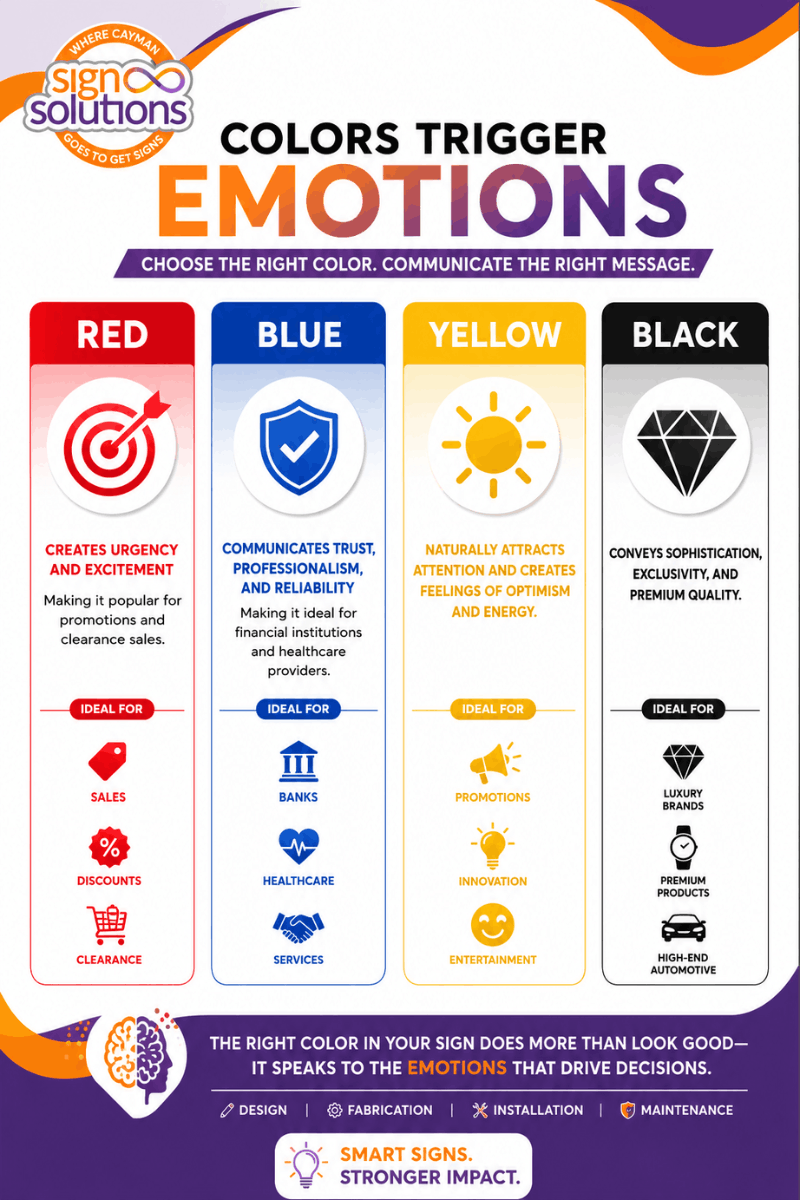
If you understand your business well, then it is important to know the color psychology of signage. This knowledge helps you align your brand visual identity with customer expectations. You must be extra careful while deploying your branding color strategy. The right color usage helps the audience recognize your brand and establish an emotional connection.
Eye-catching sign colors can create a mesmerizing effect. Choosing appropriate eye-catching colors is a tricky process that should never be based purely on personal preference. You should discuss the company's strengths and brand objectives with your Creative Signage Partner in Cayman. Your partner will facilitate the creation of overall business branding visuals that leave a lasting mark on your customers’ memories; isn‘t this world of colors marvelous and charismatic?
Distance Changes Design Performance
Viewing signage from a distance is altogether a new ball game that most businesses overlook. Suppose you look at a sign from three feet, and it looks clear. Now, move beyond three feet and try reading it from across a busy road; the sign would become almost unreadable and ineffective.
If you want your long-distance signage to be effective and deliver performance, you must consider its viewing angles, font size, contrast, spacing, and image complexity before sending it for production.
If you thought that large blocks of text, complicated graphics, and excessive details would suit your outdoor advertising visibility, then you are highly mistaken. Customers only have a moment to read your sign. Installing text-rich and complicatedly designed signs won’t do you any good. Your efforts, time, and money will all go to waste.
Simplicity is the thumb rule for the success of a roadside sign’s readability. Make sure to have larger text, cleaner layouts, and fewer visual elements to help your sign communicate your brand message clearly and consistently.
Large-format sign design not only gives a professional look to your sign but also balances aesthetics with practical visibility. It also ensures that the message performs well even when viewed from a distance.
Movement Alters Human Attention
There is a vast difference in the way people walking through a shopping center interact with signage and the drivers traveling at highway speeds. Pedestrians have the option to stop, read the message or information, and explore the details mentioned on the sign. On the other hand, drivers cannot perform any of these actions.
Hence, traffic visibility signs are fundamentally different from standard storefront graphics. This implies that highway advertising signs need to display limited text yet emphasize the brand tone.
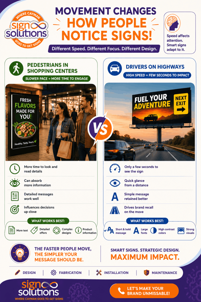
A simple logic that works here is that when people move faster, they read and retain less information, whereas those walking through have the time and opportunity to explore more intricate content. Hence, the success of fast, readable signage depends purely on the strength of the published visual hierarchy, the use of bold typography, and concise messaging.
Similar Blog: Roadside Signs Capture Customer Attention
If you have more information to share with your audience, a well-designed commercial roadside sign will make a great choice. The success and effectiveness of these commercial signs is a combination of simplicity, strategic lighting, and clear branding. When these elements come together, they maximize brand recall within the shortest possible span.
Lighting Creates Visual Dominance
Lighting dramatically changes how people perceive signage. It can transform your simple-looking sign into an impressive showstopper. Lights begin showing their true magic after dusk.
Think of a sign that performs exceptionally well during the day, but it disappears after sunset. The sign hasn’t moved elsewhere. But the only reason is that the design isn’t supported by a proper light source.
If you want your sign to perform throughout the day and night, modern illuminated business signs can help extend and improve your brand visibility.
There have been substantial advancements in LED signage visibility. With new technology, they offer consistent brightness, high energy efficiency, and excellent color precision. Even while a driver is viewing your sign from a distance while driving, the balanced illumination prevents glare and offers real clarity. Signs that were clearly visible during the daytime now also offer a comfortable view of nighttime commercial signs. These signs have multiple comfortable reading and viewing angles.
Thanks to technology-driven lighting. Your customers can enjoy and appreciate the halo effect, edge lighting, and backlit sign solutions that make your signs look premium and professional even in crowded commercial localities.
Only when lighting is used strategically do your signs get transformed from ordinary-looking signage into a Visually Enhanced Landmark.
Smart Signage Starts with Strategy
Great signs with attractive graphics will never go out of fashion.
The science of smart signs combines psychology, visibility, branding, placement, typography, lighting, and material selection into one carefully planned communication tool.
At Sign Solutions, every project begins with an understanding of how people notice and process visual information. Rather than simply creating beautiful signs, the focus is on delivering professional sign design that performs in real-world environments.
Whether businesses require custom signage in the Cayman Islands, complete business branding solutions, or guidance from experienced commercial signage experts, strategic thinking ensures every sign captures attention and leaves a lasting impression.
Remember: Your sign has only a few seconds to make an impact. Make every second count.
If you are ready to create signage that truly gets noticed, contact Sign Solutions today. Let your brand stand out with signs designed around great values and brand vision, not just aesthetics and dumb content.