At its best, a restaurant’s signage gives clear, concise information that drives new business. At its worst, it’s a mess of visual pollution that does nothing except confuse, annoy, and reduce business. Here’s how to use signage to best effect in the highly competitive world of Cayman Islands restaurants.
Signage is everywhere there are humans. Signage provides information, directions, it gives warnings, instructions, it demands our attention, and attempts to change or influence our behavior. Like other forms of advertising, it uses psychology to exhort us to follow its message for the desired outcome, whether it’s to follow a route on a highway or which restroom to use at an airport or where to go for a meal in a strange town.
Whatever a restaurant sign ‘says’, the best restaurant signs follow some basic principles of design, as well as human psychology, in order to be effective. In the restaurant world, these basic principles applied effectively, will draw in customers and give them confidence that what they expect to find inside your establishment is as good as, or better, than promised on your signage. The basic principles for signage in the Cayman Islands are no different to anywhere else. Here are a half-dozen to consider:
Positioning
Where is the sign going to be placed? Look at your location, look at its visibility from the street, or wherever there are people who you want to attract. From what distance should your signs be visible? What other signs will they need to compete with? Does a sign need to be illuminated? Proper location and positioning are essential. The best sign in the world is useless if it’s not being seen.
Logos
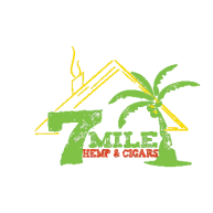
One of the very first things a new business has to decide on is a logo. It’s a core element of a restaurant’s advertising, marketing, and the public persona it wants to project. A restaurant’s logo is often the largest – or only – thing on its main signage, especially if the name itself is a trademark, a brand in specific colors or fonts. Any other words or graphics on the signage must sit comfortably with this principal design element in an aesthetically pleasing way yet still convey its intended message easily and with clarity.
Fonts
The first rule of choosing a font is whether it’s fit for purpose. There’s a reason why road signs are not written in decorative fonts like Old English or Broadway. They’re not only inappropriate they are difficult to read and the message is diluted – or even lost – by trying to decipher it in the short amount of time available to read as it flashes by. The best font for a restaurant sign is the one that reinforces and complements the unique elements of your logo and other graphics while fulfilling its purpose of providing information that encourages potential customers to enter your business. If writing is meant to be read, then make it easily readable as well as aesthetically pleasing.
Visuals
Graphics and visuals are universal. If your business is setting up in an area where tourists and non-native speakers are a significant part of your potential customer base, then a picture really is worth a thousand words. Rather than describing the same thing in multiple languages, alphabets and language fonts, a photograph or a graphic as part of the signage can reduce clutter and visual chaos, making it clean and readable.
Size
Too big or too small is going to affect the usefulness and effectiveness of a sign. The main sign above a restaurant door is going to be a different size to one above the entire frontage. If it can’t be easily seen or read because it’s too high up, or too small, or so ridiculously large that it draws attention in a negative way, then its effectiveness is reduced. The best restaurant sign design is one that catches the eye and gives the information a potential customer needs in order to make a decision. It’s rarely the biggest, most garish one on the street.
To learn more, check out our article on How important are font type, color, and size in a Sign.
Competition
Walk down any commercial street in George Town, especially the older and narrow ones where there are alleyways, crowds, and shared entrances to buildings with a lot of footfall. Now imagine where a new restaurant sign can be placed that will stand out from the forest of competing signs all screaming for attention. Size, color, font, and design will all need to be working in unison for a sign to stand out and fulfill its intended purpose.
Signage is everywhere. Competition for attention is cutthroat. To stand out from the crowd, to get a message across effectively, requires professional help in getting the most effective signage. At Sign Solutions, we have the creative skills and the entrepreneurial know-how to help you promote your products and services in the Cayman Islands. Get in touch today to discuss your requirements. Tel: 943-SIGNs (7446) or Email: info@signsolutions.ky