Sign Solutions has been our "Go-To" source for all of our Corporate sign, banner and vehicle branding needs for years. Their team is always extremely responsive and their product quality is exceptional for the price. We highly recommend the services of the Sign Solutions!
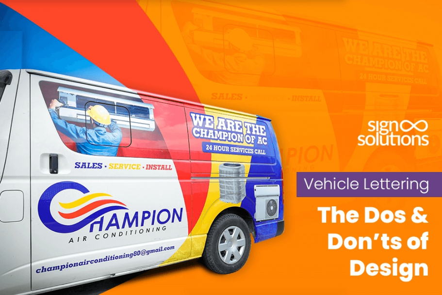
Vehicle Lettering – The Dos & Don’ts of Design
Turn every commute into a marketing campaign.
Ever seen a business van with lettering you couldn’t read?
Perhaps Yes; Perhaps No.
But don’t let that happen to your vehicle. Remember that your van is more than just a mode of transportation. You, too, would agree that it is meant to be a moving billboard with clear, compelling, and impossible-to-ignore lettering that is powerful enough to turn heads.
Make all the difference to your brand with the must-know design rules that make your sign engaging and road-ready.
Introduction
In today’s competitive landscape, will your business accept over-expensive advertising campaigns or leverage the beautiful benefits of a cost-effective and highly impactful business vehicle advertising?
A well-placed and decently designed vehicle lettering is a vital element that enhances your brand visibility. Always insist on having professionally designed lettering for your van, as it leaves a lasting impression on the passersby. The biggest benefit of having vehicle letting is that it promotes your brand wherever your vehicle goes.
The Importance of Legible Fonts
Your vehicle lettering will make no sense unless the text is easily readable even from a distance or while your car is in motion. So, never select complicated fonts that make reading an uphill task for your audience.
When you want your message to get across quickly and clearly to the audience, the simplest thing to do is choose legible fonts for vehicle lettering. You might be a big-time fan of ornate or overly decorative typefaces as they look beautiful on paper, but the story is otherwise for messages displayed on vehicles. Don’t feel surprised if such overly decorative fonts hinder the message from being easily comprehended on the roads.
Now that you have decided to go for simple and readable vehicle graphics, which fonts will serve you best? An honest answer is to feature bold, sans-serif fonts like Helvetica, Futura, or Arial. Along with these fonts, do care to use the correct font weights and spacing. Both these elements will enhance the beauty and clarity of your message when the vehicle is on the move.
You can consult an expert signage-making company in the Cayman Islands, and they will provide you with font selection tips. Even if creative letters look amazing, the clarity of fonts should be your primary goal because if your audience can’t read it in a few seconds, consider that you have lost them.
Related Blog: Things To Keep In Mind While Choosing A Custom Vehicle Signage
Choosing High-Contrast Colors
The most striking designs fail to deliver results without proper contrast. High-contrast vehicle lettering is essential for maximum visibility. For instance, white letters on a black or dark-colored vehicle offer exceptional clarity. In contrast, yellow text on a white van will likely go unnoticed.
Color combinations for vehicle graphics like black on yellow, white on dark blue, or red on silver have proved to be ideal choices and are frequently used for optimum results. For best results, do check your palette in natural light. You must check the impact of shadows and reflections on the visibility of your sign before finalizing your color combination.
To beat the competition, your lettering must stand out. Hence, stay away from colors that gel with the paint of the vehicle. Whether sunny roadways or shaded parking lots, your message will stand out for sure if you prioritize vehicle lettering visibility.
Optimal Letter Size and Placement
Have you ever wondered why some vehicle lettering becomes popular while others don't? It all comes down to the fact that the ones that fail to impact don’t follow the vehicle lettering size guide. If you follow this guide and adopt the right approach, your message will be crystal clear and visible even from a distance.
Experts recommend a proven formula; give it a try. For every inch of letter height, you gain about 10 feet of readability. That means, if your letters are bold and 6 inches in height, they can be easily read from approximately 60 feet away.
Beyond size, optimal letter placement is equally essential. It is your secret weapon for boosting both readability and brand impact. Visualize a condition where your vehicle is in a high-traffic zone. Which hot spots will attract maximum attention? The rear tailgate and side doors will be perfect for catching attention in traffic. If you own a taller vehicle, even the roof placement can be a prime asset. Focus on these three placement locations to achieve successful visibility.
It is not necessary to fill all the space in your signage, as your message also needs to breathe. Always refrain from crowding text near edges and around vehicle curves. If you follow this simple advice, your message won’t look distorted and will be easier to read. Moreover, keep consistent spacing between the letters. Balance the overall look by keeping your text in sync with logos and graphics.
Keeping the Design Simple and Clear
Nothing is more beautiful and appealing than a simplistic design. A simple lettering design does away with any doubts and receives only appreciation. People love simple vehicle lettering design for its ease of reading. Besides, it looks more professional and stays in their memory for a longer duration. Share as much information as is necessary; anything in excess goes to the trash.
People don’t have the whole day to read your message, and your vehicle is also on the move, so don't over-crowd your car with information. Respect your viewers’ time by offering them limited but accurate information that can be easily absorbed in only a few seconds.
Your sign should also consist of your logo, company name, main service, and contact details. Having clear vehicle graphics with a consistent font in your lettering design will maintain uniformity all across the signage.
Some people have the urge to highlight every service or achievement on their van, but that isn’t in the interest of your brand. Avoid cluttering your signage, preserve the overall impression of the main message, and let people remember and relate to your brand with ease.
Using High-Quality Materials
With time, every product faces wear and tear. But using superior quality material helps make the product durable and maintain its looks, feel, and texture fresh as new. Being durable, such products deliver value to customers and earn their precious trust.
So, by investing in high-quality vehicle lettering materials will offer long life to your sign and keep the message vibrant and intact over time. We understand that using high-quality raw materials will require you to invest additional money, increasing the cost of the final signage. Now, what happens if you use a low-grade material? If you use an inferior quality vinyl, there are greater chances of it fading, cracking, or peeling, and this damage is more dangerous to your brand image and your vehicle. For a moment, you may consider replacing the damaged vinyl sheet, but what about the damage that would happen to the color, texture, and surface of your car or commercial van? Wouldn’t that be a costly affair? Hence, it is advisable to invest your money in high-quality materials rather than waste it on cheaper alternatives.
If you are determined to use durable vehicle graphics, choose the one that can withstand sun exposure, rain, washing, and harsh weather conditions. Cast vinyl film is a great option. It offers long-term durability, superior visibility, and better conformability on curves and contours.
Professional signage materials sourced from reliable vendors bestow your vehicle with a polished, trustworthy appearance that reduces the likelihood of damage resulting from reapplication procedures.
Avoiding Common Design Mistakes
While our focus is on creating simplistic yet appealing vehicle lettering designs, it is essential to take precautionary measures to avoid errors. Because it is too tricky, seasoned businesses also fall prey to these errors, which can be easily avoided. A few frequent vehicle lettering design mistakes include:
- Using multiple fonts, creating a chaotic and busy look
- Don’t generalize. Every vehicle is unique. Take its shape and contours into account.
- Placing text over door handles or seams.
- Not abiding by the local sign regulations or licensing guidelines.
These common signage errors reduce effectiveness and can even result in fines. Always test layouts on a vehicle template and consult professionals for placement.
To make your car look attractive, follow vehicle graphics best practices. Use mockups, a professional installation, and stick to local protocols. These steps will make your design look aesthetic and functional.
Incorporating a Clear Call-to-Action
Now that you have taken care of the letters, their size, colors, and design, how would you inspire your audience to take some action that would generate business for your brand?
A strong vehicle lettering call-to-action is the answer to this question. When you advertise something, your core purpose should be to let the campaign reach your specified audience and tell the audience exactly what to do next. This next action can be like calling you (or your team), visiting your website, or following your brand on the social media networks.
To create a CTA (Calls to Action) that is effective and impactful, follow these key steps.
- Keep it concise,
- Should be action-oriented,
- Let it focus on the user's needs,
- Clearly communicate the desired action,
- Has to be visually appealing,
- Place it strategically for maximum impact.
What should be included in a CTA?
- It should include a phone number in large digits.
- Mention the URL of your website or landing page.
- Include a QR code that comprises the necessary information.
What matters most is that you should present all the information in a clear, concise, and easy to read manner.
Your car might drive past a potential customer on the highway or be parked on a busy street; always ensure that your effective CTA in signage is inviting, engaging, and builds curiosity in the minds of the passersby. Your CTA should offer your audience the opportunity to approach your brand with a positive intention to buy.
Why Choose SignSolutions for Vehicle Lettering
At SignSolutions, we take pride in delivering exceptional custom vehicle graphics that align with your brand and boost your reach. As a trusted Cayman Islands sign company, we specialize in expert sign installation, combining visual appeal with long-term performance.
From font and color selection to compliance and material quality, our team follows all the best practices outlined above. We understand vehicle lettering importance and apply that knowledge to every project, large or small.
Choosing SignSolutions signage means partnering with professionals who value detail, consistency, and customer satisfaction. Our local knowledge and high standards make us the perfect choice for your next business vehicle advertising campaign.
Conclusion
If done right, vehicle lettering transforms your fleet into mobile brand ambassadors. From choosing legible fonts for vehicle lettering and high-contrast vehicle lettering, to optimizing the vehicle lettering size guide and avoiding clutter in signage, each design decision plays a pivotal role in building brand recognition.
By applying these insights and avoiding vehicle lettering design mistakes, you can create signage that works hard wherever the road takes you. If you want professional vehicle graphics tips tailored to your brand, trust SignSolutions to bring your vision to life with expert design and installation.
Remember, the vehicle signage impact isn’t just in the design—it’s in how well you execute every element. Drive your message further with effective vehicle lettering that delivers results.
Recent Blog
Designing the Perfect Van Decals: What Really Works
Speed, consistency, and delivery accuracy are mainly visible on streets and highways. It is a common sight when you see a van speeding past your sight...
Read More
Street and Traffic Signs: The Silent Directors of Your Streets
Traffic signs are meant to make our lives easier and simpler on the streets and at crossroads. Every day, millions of people commute to and return fro...
Read More
Quick Fixes To Make Your Storefront More Inviting With Simple Signage
For any retailer, the storefront is the first brand ambassador that invites, impresses, and silently engages with your customers. With the signage ins...
Read More
The Psychology of Space: Using Wall Graphics to Boost Employee Morale
Employees at any organization spend more than 33% of the day at their workplace. Hence, it is quite natural that the same workplace influences and sha...
Read More
Monument Signs: A Simple Guide for Businesses
Before diving into the topic and comprehending its business perspective, let’s understand what a monument sign is. The first thing we need to unders...
Read More
