Start With Your Brand Personality
As a business owner, how do you perceive your brand?
Is it limited to the four walls of your retail store or corporate office?
On the contrary, your brand is far beyond the walls. It presents your business philosophy, culture, and the company's vision to local and global customers in the most elegant way.
It is a pity that your reception wall is still empty. It's not an empty wall, but a welcoming canvas inviting you to decorate it with the best reception wall decals.
Before choosing colors, patterns, or lettering for your reception decal, think like a visitor who is waiting in the reception area.
Think:
- What triggers his thought process?
- What makes him feel delighted while entering your office?
- Does he consider your business to be professional and dependable?
- Is your business modern and forward-thinking, warm and welcoming, creative and energetic, or premium and luxurious?
With several thoughts rushing through his mind, it becomes difficult for him to picture your business accurately.
Because this business is yours, you must play a pivotal role in guiding every visual decision.
For example:
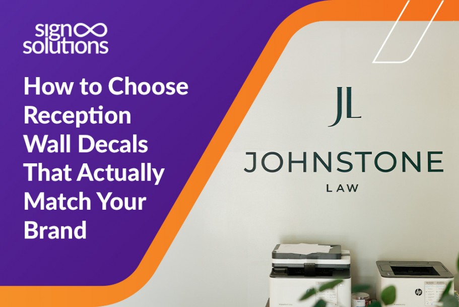
- A law firm may need clean lines, restrained colors, and refined lettering.
- A children's service provider may benefit from brighter colors, friendly graphics, and softer shapes.
- A technology company may prefer bold geometric elements and a modern layout.
- A luxury real estate agency may use muted tones, elegant fonts, and minimal architectural graphics to create a premium, trustworthy reception experience.
There is a close relationship between your brand and your wall graphics. Even if people are attracted, appealing branded wall graphics can still feel out of place if they do not reflect the true business essence.
Visitors might find a playful mural in a formal financial office more confusing than reliable and trustworthy. When you are sure of what brand purpose and essence your reception decal should project in a socio-economic environment, use office wall branding to create an instant alignment between people and what your business stands for.
Before choosing a suitable reception wall decal, why not list a few words that actually define your brand? This simple exercise gives your design a clear direction and prevents it from becoming just another decorative piece of furniture.
Build Around Your Existing Interior
Your reception wall is the first thing your visitor sees when he enters your office. It is not just a wall but a gateway to a larger environment. This reception wall isn't a standalone module but an extension of your ideas, thoughts, and vision that merge well with the flooring, furniture, lighting, ceiling height, wall color, décor, and architectural details already present in your larger environment.
Begin with a small exercise. Not all days are the same. So start observing your reception area at different times of the day. Note down the changes that you experience during each event. Natural light, warm indoor lighting, and spotlights influence how colors, textures, and finishes appear at each time.
You will experience something like the following:
- A dark decal may look bold and elegant against a light wall but disappear in a dimly lit reception area.
- Similarly, a highly colourful design may interfere with patterned furniture or busy flooring.
- A tall ceiling will overpower a small logo, making it appear insignificant. Hence, using a vertically balanced design or larger lettering will help maintain a strong visual presence of your brand
When you create your office wall decal design thoughtfully, it will complement the room's ambiance rather than competing for the visitors' attention. If your reception has strong visual features, it is a good idea to balance it with a more restrained wall color and texture. Doing so will give a smoother experience and help visitors stay focused on the reception interiors. If the area is plain or neutral, installing creative reception area graphics will bring your office to life without making it feel too busy.
No single element like a wall, ceiling, or flooring can exist on its own. Your interior wall branding appears appealing only when all these elements coordinate well to deliver One Single Space.
Should every empty area be covered?
Factually, the answer is no. Your aim should be to use the strategic areas of the wall as a visual extension of your brand vision, delivering a unique and memorable office experience to visitors. Custom-built commercial wall decals should give the feeling that they already belong there from the beginning.
Choose Colors Beyond Your Logo
Using your logo colors is important. But how would you feel if you were to see the same color all around you? It wouldn't feel that enjoyable. Likewise, covering the whole wall in the same bright shades can feel overwhelming. Hence, the best approach is to use a balanced palette to strengthen your branding.
Using your main logo color as an accent will be an appropriate approach. You can support the primary color with secondary colors and neutral tones such as white, grey, charcoal, beige, or soft pastels. This combination will bring in a magical effect to your reception area, where the logo and important messages will stand tall without overwhelming the visitors' thought process.
Contrast and lighting are two important aspects that can make or break your office wall decal design. When selecting brand colors for wall graphics, do keep contrast and lighting in view for optimum results.
Picture this:
- A pale yellow shade looks beautiful on a plain screen, but will it look equally great if placed against a cream wall?
- A dark purple shade looks rich and professional when there is enough contrast.
Before a visitor can connect with your brand, he should be in the right frame of mind. Here, your office branding colors should create the right mood while remaining comfortable to look at every day. To achieve well-planned custom office wall graphics, use color with purpose, and the result will feel unique and appealing.
 Make Typography Work at Scale
Typography is the art and technique of presenting your message through well-arranged letters in a clear, lucid, readable, and visually appealing written format. Typography isn't the same everywhere. It is different for reception, business cards, catalogues, and digital media.
You never know where your visitor would position himself. He might be standing or sitting several feet away. Other visitors might view the reception wall from across the room. Despite the distances, readability has to be premium and prominent.
That means there is no way to compromise on letter size, spacing, font weight, and layout in any scenario.
Your choice of wall graphic typography should coincide with clarity at a predefined distance. You might prefer using fine, delicate fonts because they look elegant in a digital mock-up. You will be surprised to know that these same fonts are difficult to read when applied to a large wall. You do not need to install bold fonts at your reception. But what is important and necessary is that these letterings should have adequate visual presence.
Your office wall lettering can deliver effective output only if they have proper breathing room. Crowded words, tightly packed lines, and lengthy paragraphs can not only make your wall feel chaotic but also shatter the real purpose of reception wall lettering. Use hierarchy to guide the eye. Your logo should come first, followed by a short tagline. Key value and welcoming message should follow thereafter.
Remember that clarity always counts more than decoration. If your brand uses a distinctive font, it can often be adapted for a wall application by adjusting its weight, size, or spacing. Professional custom vinyl lettering helps preserve the character of your brand while making the message easy to read.
Match Graphics with Your Message
It is important to ensure that your presented message and created graphics are coherent, coincide with each other, and communicate the same idea or vision to the visitor.
Your reception wall is, of course, your canvas where you can freely introduce your logo, share your company values, display a concise mission statement, feature a memorable tagline, and visually illustrate your business story.
Your visitors have limited time. Hence, you must decide what visitors should understand within the first few seconds.
Should they see:
- Professionalism,
- Creativity,
- Heritage,
- Community involvement,
- Innovation,
- A promise of exceptional service
Use branded wall graphics to highlight and reinforce the company's core message.
Example:
- A company with a strong local connection may use subtle Cayman-inspired visual elements.
- A wellness brand may use calm imagery and spacious layouts.
- A service-led business may highlight a simple statement that reflects its customer promise.
Many professionals are eager to tell everything about their business, but in reality, an overload of information is unnecessary and dangerous. So please say only what is required. Your customer isn't interested in all that you provide; he is interested in knowing if you have a solution to his problem.
Too much text, too many icons, or unrelated images will make your company wall graphics look cluttered. An office mission statement on the wall looks great when the message is presented in a short, relevant, and genuine way.
Your reception branding ideas need to be simple yet meaningful. Simplicity enables your visitors to digest your concept with ease.
Size Changes the Entire Experience
An incorrect size can destroy the essence of placing reception wall decals. Not only the design, but the wrong size can still make your correct design fall apart.
Simply picture this:
How would small graphics look on a large wall?
Would oversized logos in the reception area make it feel unbalanced and cramped?
When planning large wall decals, consider the full wall composition. Measure the surface area, note the placements of doors, windows, switches, furniture, and other important features. Then, decide where visitors will stand to view your wall design.
An effective reception wall design intentionally uses negative space to ensure that the area surrounding a logo or message isn't wasted. This approach provides the design with room to breathe, enhancing its visibility.
Professional wall graphic sizing also calculates ceiling height and viewing distance. A design that looks proportionate from a desk may appear too small from the entrance that is at a distance. Review the artwork before production. A wall mock-up can help you a lot.
Well-planned custom wall graphics create visual confidence. They feel substantial enough to make an impression yet balanced enough to suit the room's aesthetic.
Select Finishes for Your Environment
The finish of a wall decal affects both its appearance and maintenance. Matte, gloss, textured, frosted, and specialty materials each create a different effect.
Matte finishes are popular for reducing glare and creating a refined, modern look. Matte wall graphics are especially useful in brightly lit reception areas or spaces with large windows. Gloss finishes can make colors appear more vibrant, but gloss wall decals may reflect light and show fingerprints more easily.
When reviewing vinyl wall decal finishes, consider the environment. Is the wall near a busy entrance? Will it require regular cleaning? Does the space receive direct sunlight, strong lighting, or experience humidity? These factors can influence which material will remain attractive over time.
High-quality commercial vinyl graphics should support both daily practicality and visual appeal. The right finish protects your investment and helps your reception stay polished longer.
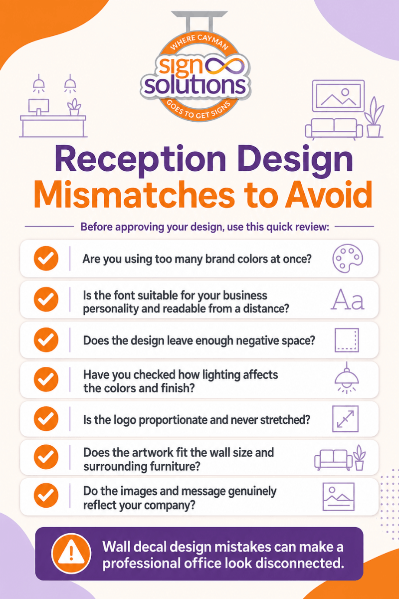
Avoid These Reception Design Mismatches
Frequent office branding mistakes include copying a digital design directly onto a wall without adjusting scale, overcrowding the artwork, or choosing trends that do not suit your brand.
Avoidable reception design mistakes typically stem from focusing on individual elements rather than the complete space. Use these wall graphics design tips to review the final design with a practical, visitor-focused eye.
Similar Blog: Reasons Why Reception Signage Is Important For Your Office
 Create Your Brand with SignSolutions
Your reception area should make visitors feel they have entered the right business. At SignSolutions, we help turn your identity into a wall design that feels polished, intentional, and true to your brand.
From custom wall graphics in Cayman to vinyl decals, large-format printing, material selection, finish recommendations, and professional installation, our team considers both your visual identity and your office environment.
Whether you require impactful reception wall decals in Cayman or a complete office reception wall decal upgrade, SignSolutions can help you create a reception wall that makes the right first impression. Contact us today for a consultation or a custom wall graphic quote.